
Your kitchen backsplash does more than protect walls from splashes and stains. It serves as a focal point that can completely transform your space. The right color choice creates visual interest and ties together your countertops, cabinets, and flooring. It can make a small kitchen feel larger or add warmth to a sterile space.
Before choosing colors, consider your kitchen’s existing elements. Look at your cabinet finish, countertop material, and the amount of natural light your space receives.
Classic White and Neutral Tones
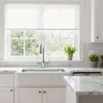
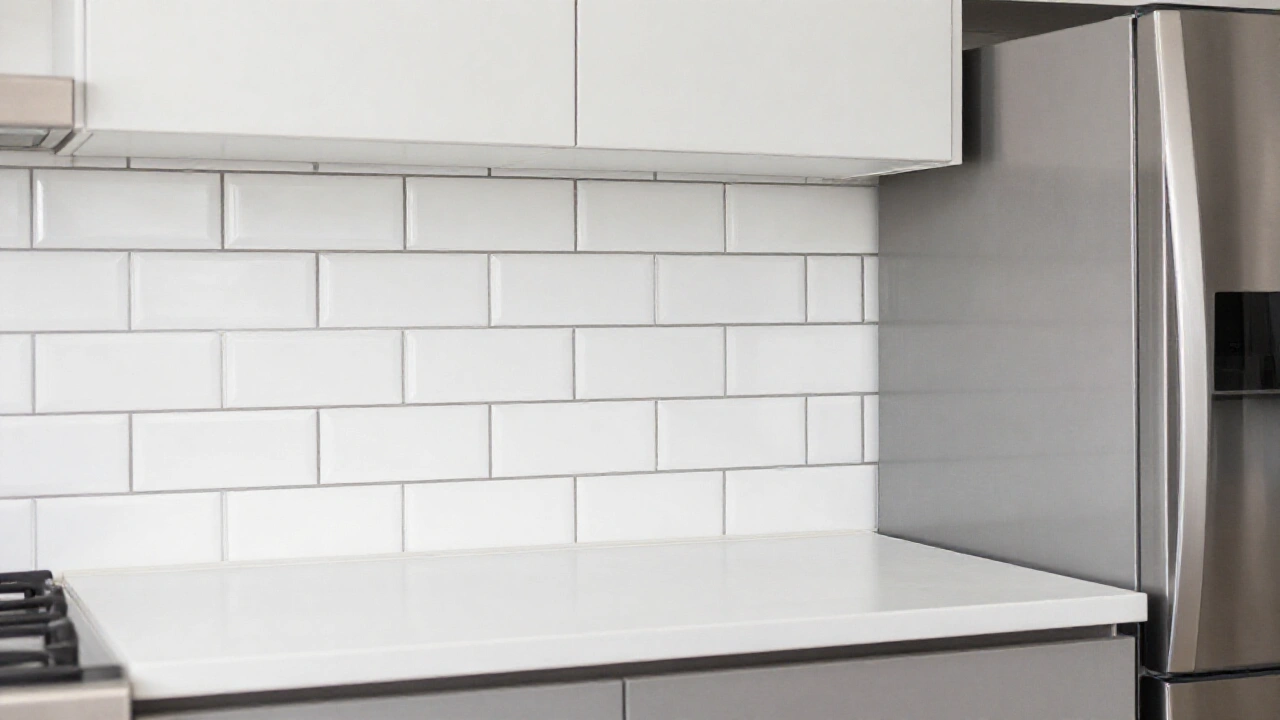
White remains the most popular backsplash color for good reason. It works with virtually any cabinet color and makes kitchens feel bright and spacious. Subway tiles in crisp white create a timeless look that never goes out of style. You can add interest with different tile patterns like herringbone or vertical stacking.
Beige, cream, and off-white options provide warmth while maintaining versatility. These colors pair beautifully with both light and dark cabinetry.
Consider textured white tiles or natural stone in light tones for added visual depth. These materials catch light differently throughout the day, creating subtle shadows and highlights.

Bold and Vibrant Statement Colors
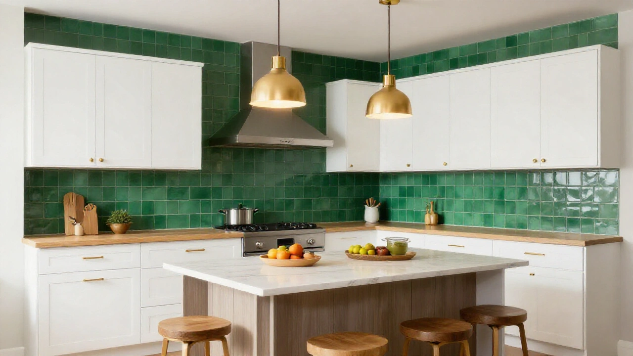
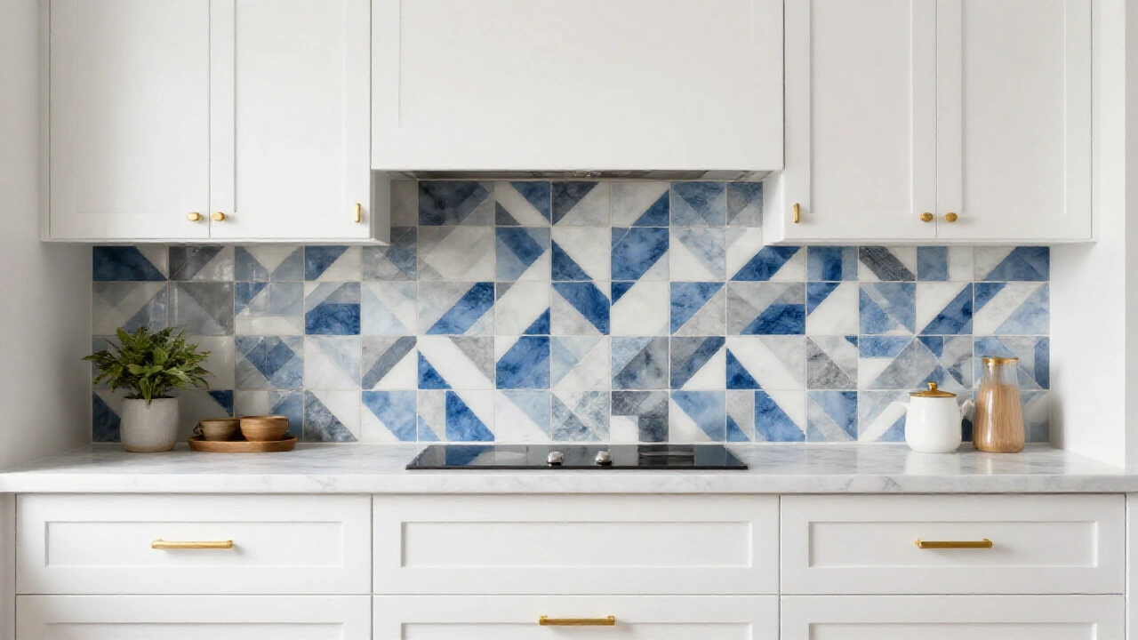
A colorful backsplash can become your kitchen’s personality statement. Rich blues, emerald greens, and deep burgundy create drama and sophistication. Bright colors work especially well in kitchens with neutral cabinets. A bold backsplash against white or gray cabinets creates a stunning contrast.
Consider your kitchen’s size when choosing vibrant colors. In smaller spaces, use bold colors sparingly as accent areas rather than covering entire walls. Popular statement colors include navy blue, forest green, and terracotta. These colors add warmth and character while remaining stylish for years to come.
Recommended: 22 Gorgeous Green and Brown Kitchens Looks for Your Next Remodel
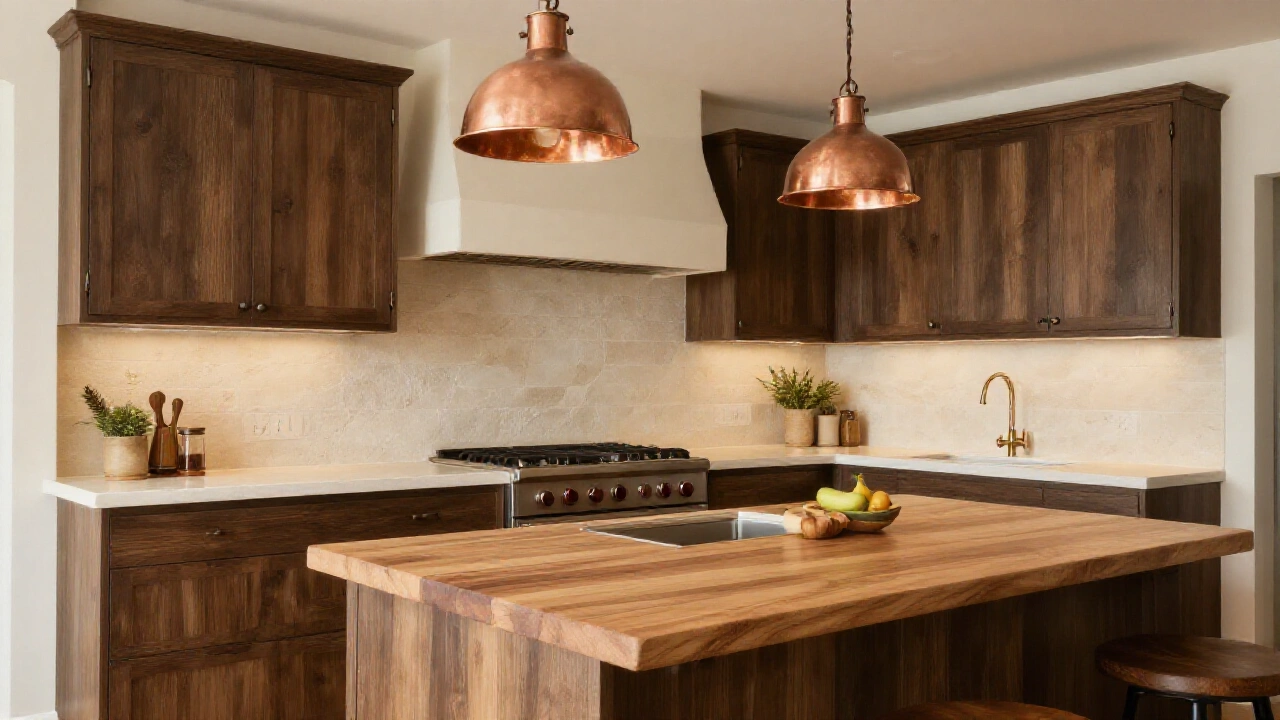
Earth Tones and Natural Colors
Earth-inspired colors bring warmth and organic beauty to your kitchen. Think warm browns, soft taupes, and muted terracotta shades. Natural stone backsplashes in travertine or sandstone offer beautiful color variations. Each tile displays unique patterns and hues that create visual interest.
These colors complement wood elements beautifully. If you have wooden cutting boards, floating shelves, or hardwood floors, earth tones create perfect harmony. Consider mixing different shades within the same color family. Varying tones of brown or beige add depth without overwhelming the space.
See also: 22 Gorgeous Green and Brown Kitchens Looks for Your Next Remodel
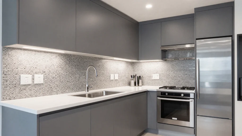
Gray Scale Options for Modern Appeal
Gray backsplashes offer sophistication and work with both warm and cool color schemes. Light grays feel fresh and contemporary. Charcoal gray creates drama while remaining neutral enough for various design styles. It pairs beautifully with white countertops and stainless steel appliances.
Consider different gray tile finishes for variety. Matte tiles provide subtle elegance, while glossy finishes reflect light and make spaces feel larger. Mix different shades of gray for a sophisticated ombre effect. Start with lighter grays near the ceiling and gradually transition to darker tones near the countertop.
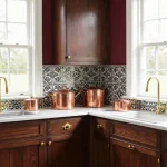
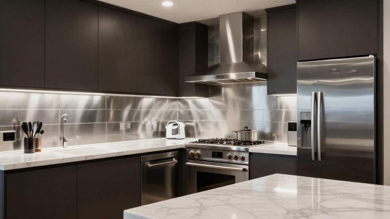
Metallic and Reflective Finishes
Metallic backsplashes add glamour and reflect light beautifully. Stainless steel creates a professional look that complements modern appliances.
Copper tiles develop a natural patina over time, adding character and warmth. Bronze and brass finishes bring luxury and pair well with traditional designs.
Mirror tiles or glass mosaics with metallic backing create stunning light effects. These work especially well in smaller kitchens where reflected light makes spaces feel larger.
Consider combining metallic accents with other materials. A few metallic tiles mixed with ceramic or stone creates sophisticated contrast without overwhelming the space.
Pattern and Texture Color Combinations
Patterns can incorporate multiple colors while maintaining visual cohesion. Moroccan-inspired tiles often feature blues, whites, and earth tones together.
Geometric patterns in contrasting colors create modern focal points. Black and white geometric tiles add graphic interest without overwhelming the space.
Textured tiles in single colors provide depth and interest. Dimensional tiles cast shadows that change throughout the day as light shifts.
Consider how patterns will look with your cabinet hardware and fixtures. Busy patterns work best with simple, clean-lined cabinetry and minimal accessories.
Color Coordination with Countertops and Cabinets
Your backsplash color should complement, not compete with, your countertops and cabinets. Look for colors that appear in your countertop’s veining or pattern.
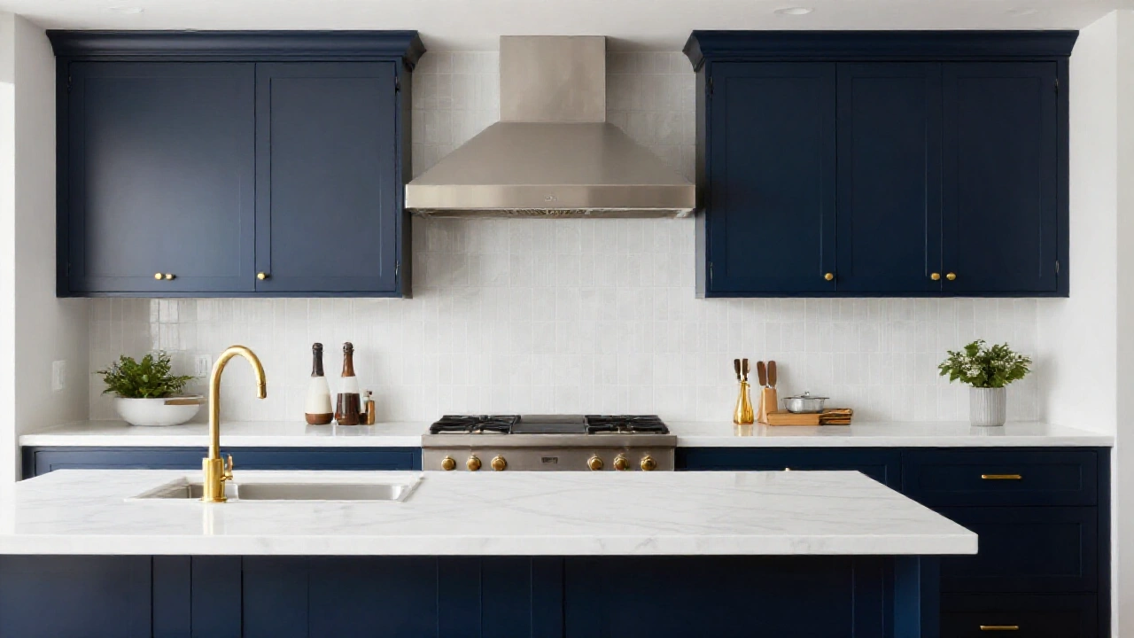
With white cabinets, you have endless backsplash color options. Dark cabinets work beautifully with lighter backsplashes that provide contrast.
Consider the undertones in your materials. Warm-toned cabinets pair well with backsplashes that have similar warm undertones, even in different colors.
Create a cohesive color story by repeating accent colors throughout the space. If your backsplash features blue, incorporate blue in accessories or window treatments.
Lighting Considerations for Color Selection
Natural and artificial lighting significantly affects how backsplash colors appear. Colors look different under warm LED lights versus cool fluorescent lighting.
Test your color choices at different times of day. Colors that look perfect in morning sunlight might appear dull under evening artificial lighting.
Glossy tiles reflect light and can help brighten dark kitchens. Matte finishes absorb light and create a softer, more subdued appearance.
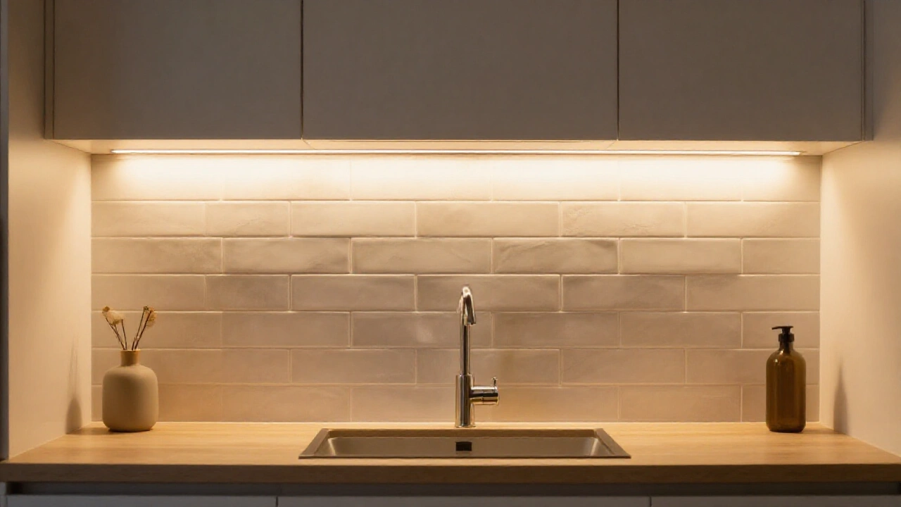
Consider installing under-cabinet lighting to highlight your backsplash. This lighting creates ambiance and ensures your color choice looks its best at all hours.
Maintenance and Practical Color Considerations
Light colors show water spots and fingerprints more easily than darker colors. Consider your cooking habits and cleaning preferences when choosing colors.
Dark grout lines hide dirt and stains better than light grout. However, light grout creates a cleaner, more seamless appearance with light-colored tiles.
Glossy finishes are easier to clean than textured surfaces. If you do lots of cooking that creates splashes, prioritize easy maintenance over texture.
Neutral colors remain timeless and won’t look dated as trends change. If you plan to stay in your home long-term, choose colors you’ll love for years to come.
See also: 14 Small Kitchen Design Ideas
Frequently Asked Questions
What backsplash colors work best with white cabinets?
White cabinets pair well with virtually any backsplash color. Popular choices include subway white for a classic look, bold colors like navy or emerald for contrast, or natural stone for warmth and texture.
How do I choose a backsplash color for a small kitchen?
Light colors make small kitchens feel larger and brighter. White, cream, or light gray backsplashes reflect light and create an open feeling. Avoid dark colors or busy patterns that can make spaces feel cramped.
Should my backsplash match my countertops?
Your backsplash doesn’t need to match your countertops exactly, but they should complement each other. Choose colors that appear in your countertop’s veining or select contrasting colors with similar undertones for a cohesive look.
What are the most timeless backsplash colors?
White, cream, and light gray are the most timeless backsplash colors. These neutral tones work with changing trends and various design styles, making them safe long-term investments for your kitchen.
How do I test backsplash colors before installing?
Get large tile samples and tape them to your wall for several days. View them at different times and under various lighting conditions. This helps you see how the color looks with your existing elements throughout the day.