
Your bedroom walls have been the same shade of eggshell since 2019. You know it. They know it. And if you’ve been searching for bedroom paint color ideas for 2026, you’re in good company. This year’s shift is real and it’s clear: cold, flat grays are out, icy blues are fading fast, and warm, grounded, deeply personal colors are moving in. Interior designers across the board are seeing the same thing. Homeowners want bedrooms that actually feel like somewhere they want to sleep.
Here are 22 specific ideas, backed by the latest trend data from major paint brands and the designers who work with real homes every day, to help you figure out what goes on those walls.
The Big Shift in 2026 Bedroom Color: What’s Really Happenin
Before getting into the specific colors, it helps to understand why 2026 feels different.
Designers are seeing a clear move away from cool, minimalist interiors and toward warm, personalized ones. The rooms that feel right now aren’t trying to look like a design magazine shoot. They’re trying to feel like somewhere a real person lives and actually rests.
Cold tones like icy blue and cool gray are dropping in popularity, and deep, saturated jewel tones have been called “visually tiring” by more than one designer working with clients right now. What’s replacing them? Colors that are restorative, earthy, and a little personal. That’s the throughline for almost every idea on this list.
One useful framework: LRV, or Light Reflectance Value, measures how much light a color bounces back (0 = black, 100 = white). For 2026 bedrooms, the sweet spot sits between LRV 45 and 65. Light enough to feel open at 7am, deep enough to feel settled at night. Pure white walls above LRV 80 can over-stimulate the eye before bed. Keep that in mind as you browse.
1. Universal Khaki (Sherwin-Williams / HGTV Home): The New Neutral That Replaced Gray

Sandy khaki is the neutral story of 2026. Grays, once the default safe choice for every bedroom, are giving way to taupes, khakis, and sandy beiges across all the major paint brand forecasts.
Universal Khaki by Sherwin-Williams is the HGTV Home Color of the Year for 2026 for a reason. It reads warm and grounded without veering into muddy territory. It works in bedrooms with natural wood floors, linen bedding, and simple furniture. It also reads beautifully in lamplight, which is exactly what you want from a bedroom wall.
Best paired with: Cream bedding, oak or walnut nightstands, aged brass hardware. Light direction: Works in any orientation, but especially good in north-facing rooms.
2. Turbinado (Clare): The Warm Earthy Depth Option

Turbinado from Clare sits in a similar earthy neutral space but with slightly more depth and a richer brown undertone. Think raw sugar, not refined. It’s the kind of color that makes a bedroom feel curated without any extra effort.
Warm natural hues like Turbinado are leading the 2026 direction because they hit that “I live in soft light” quality that’s become the new goal for bedroom design. Pair it with textured throws, a jute rug, and wood furniture and it’s almost impossible to get wrong.
Best paired with: Warm white trim, terracotta accents, linen or cotton bedding in cream. Finish: Matte or eggshell both work well here.
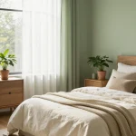
3. Daily Greens (Clare): The Bedroom Spa Color

Earthy greens are one of the biggest bedroom color stories of 2026, and Daily Greens sits right at the sweet spot: soothing, grounded, and complex enough to hold interest across the day.
Earth-inspired greens dominate because they feel calming and organic, and they pair beautifully with natural materials like wood, stone, and linen. In a bedroom, this shade brings an outdoor-meets-indoor quality. Not bold, not flat. Just the kind of color that makes you breathe out when you walk into the room.
Research backs this up too. Desaturated, low-luminance blue-green pigments on bedroom walls have been shown to reduce cortisol and heart rate, making them genuinely useful in a sleep space and not just aesthetically pleasing.
Best paired with: Linen sheets, walnut furniture, warm white ceiling. Light direction: Best in south or west-facing rooms where it stays warm.
4. Sage Green (Farrow & Ball Pigeon / Edward Bulmer Tea Green): The Designer’s Quiet Favorite

Sage is different from the deeper earthy greens. It’s softer, slightly cooler, and carries more gray, which keeps it from reading as too botanical.
Designers specifying sage green for bedroom walls in 2026 cite its ability to give a room a strong sense of identity without being loud about it. One designer noted in a recent project that painting tongue-and-groove panelling in a soft sage all the way to dado height “immediately gave the room a sense of identity and coziness” that no safe greige wall could replicate.
Farrow & Ball’s Pigeon and Edward Bulmer’s Tea Green are two of the most-specified shades in this category. Light to light-medium depth greens with enough gray to settle them down are predicted to be the bedroom green of the year, outpacing the brighter or more olive-leaning options.
Best paired with: Striped or patterned headboards, warm neutrals, natural rattan. Finish: Matte for the most depth and texture.
5. Silhouette AF-655 (Benjamin Moore): Moody Without Being Oppressive

Benjamin Moore’s Color of the Year 2026 is Silhouette: a deep smoky espresso brown with a hint of gray. It’s one of the few genuinely dark colors on this list, and it’s worth taking seriously.
The gray undertone is what keeps it from reading as pure brown. It sits in a refined, slightly sophisticated space that works for modern minimalist and layered transitional bedroom styles equally. Benjamin Moore’s 2026 trend palette encourages using it as an anchor, layering it against delicate pastels or pairing it with creamy neutrals for contrast.
Designer tip: Use Silhouette on the headboard wall only, then soften the remaining three walls with lighter tones two to three shades up the same family. This is the “return of the accent wall” move that’s prominent in 2026 bedroom design.
Best paired with: Soft whites, muted greens, warm terracotta, natural wood. Finish: Eggshell for the headboard wall; matte for surrounding walls.
6. Midnight Garden (Dunn-Edwards): Deep Botanical Green for a Moody Bedroom

If Silhouette is the moody brown, Midnight Garden is the moody green. It’s a slightly cooler, botanical green from Dunn-Edwards that leans fresher and brighter than the deeper olive tones, with a clean, outdoorsy quality.
In a bedroom with good natural light, this color looks like you brought the garden inside. It pairs especially well with crisp white trim and natural wood furniture. Go all four walls and the room feels like a wrapped garden room. Do just the headboard wall and you get drama without commitment.
Best paired with: White trim, linen bedding, brass or antique brass hardware. Light direction: Best in well-lit rooms; can feel heavy in basement or north-facing bedrooms.
Recommended: 20 Pink Bedroom Ideas for a Stylish Girls Room
7. Warm Mahogany (Glidden): Spiced Brown That Wraps a Room

Warm Mahogany by Glidden is a sumptuous red-orange that’s been softened significantly by earthy brown undertones. It’s the kind of color that sounds bold but reads warm and intimate once it’s on the wall.
This is perfect for a bedroom where you want the space to feel genuinely cocooning. It’s a winter fireplace kind of color. Use it on all four walls with dark wood furniture and warm-toned lighting and the result is a room that feels like it has its own gravity.
Best paired with: Dark walnut or mahogany furniture, cream or ivory bedding, amber lighting. Avoid: Cool-toned metals and icy white trim, which will fight the warmth.
8. “Dirty Chai” Warm Browns (Middlebury Brown by BM / Clove by SW): The Bedroom Trend with Character

The warm brown category is broader than one specific shade. Think of it as the “dirty chai” tier: spiced, mid-tone browns that have enough complexity to read as intentional rather than safe.
Benjamin Moore’s Middlebury Brown and Sherwin-Williams’ Clove are two of the most-discussed in this space. Clove is the darker, more dramatic option. Middlebury Brown sits in a balanced middle range that works well in bedrooms that need warmth without going full dark room. Both pair naturally with natural wood and look excellent in lamplight.
Best paired with: Cream bedding, warm brass, leather or woven accents. Pro tip from interior designers: If you love a brown but worry it’ll look boring, go one shade darker than you think you should. Browns almost always read lighter on the wall than they do on the swatch.
9. Warm Terracotta: The Trend That Became a Classic

Terracotta went from trend to classic without anyone announcing it. And in 2026, it’s still going strong. Designers including Janiece Lonvelin of Velène Design House report seeing a consistent client shift toward warm terracotta as one of the earthy neutrals replacing cool gray in bedrooms.
The version that works best in 2026 is faded and sun-baked, not electric. You want a terracotta that looks like it’s been outside for a season. The more earthy and desaturated, the more livable it becomes long-term.
Best paired with: Sage green accents, jute rugs, natural linen, warm wood. Color combination to try: Sage green and terracotta together (known as a biophilic design pairing) is one of the most cited 2026 bedroom color duos.
10. Chocolate Brown: The Color Nobody Saw Coming This Year

Dark chocolate brown didn’t make a big showing in 2025. In 2026, it’s arriving with real momentum.
Sherwin-Williams Clove and Benjamin Moore Willow are two versions worth looking at. Willow is the more passive, muted approach to deep brown, while Clove leans darker and more dramatic. Either works for a bedroom accent wall, particularly behind the headboard where the color creates an enclosure effect without being visible while you’re lying down.
Best paired with: Warm cream, deep green plants, amber or warm white lighting. Finish: Matte brings out the depth and stops it from looking plastic.
11. Wing It (Clare): The Grown-Up Blush-Pink

Standard blush pink has been on bedroom walls for four consecutive years. It’s not dead, but it needed to grow up. Wing It by Clare is what that looks like: a soft blush that sits closer to peach or warm sand than to bubblegum. It reads pink in warm light and almost neutral in cool light.
This is the kind of color that looks different at every hour of the day, which makes it genuinely interesting to live with. Pair it with creamy whites and rich browns and it reads elegant. Put it with crispy white trim and linen and it reads soft and coastal.
Best paired with: Cream bedding, warm white trim, natural rattan or wood. Avoid: Cool grays and icy whites, which turn it flat and clinical.
12. Subrosa (Clare): Quiet Luxury in Rose

Subrosa is one step up from Wing It in saturation. It’s soft and sophisticated with a rosy warmth that reads like “boutique hotel” when done well. It’s the color version of good lighting and fresh flowers.
The key to making this work in a bedroom is restraint everywhere else. Keep the bedding creamy or white. Keep the hardware warm-toned. Let the wall do the talking.
Best paired with: Cream bedding, aged brass hardware, white or neutral trim. Light direction: South and west-facing rooms will make this sing.
13. Soft Lavender (Lavender Mist / pale whisper tones): The Sleep Science Pick

This one has a data argument behind it. Research from chromotherapy studies has identified pale lavender as the second-most calming wall color for sleep spaces, after pale blue-green. The version that works in 2026 is not purple-purple. It’s a whisper-soft lavender that reads as “pale gray with a hint of warmth” in most lights, only revealing its lavender nature when placed next to a true white.
LRV around 67 puts this in the sweet spot for bedroom walls: light enough to feel airy in the morning, enough color presence to feel restful at night.
Best paired with: White bedding, light wood furniture, soft gold accents. Light direction: North-facing rooms, where cool light brings out the warmth in this shade.
14. Hidden Gem (Behr): The Earthy Blue-Green That Hits Differently

Hidden Gem by Behr is one of the most praised 2026 Colors of the Year among designers and color experts. It’s a richly saturated blue-green with a touch of smoke and warm undertones that keep it grounded and livable rather than stark.
Blues and greens are still trending, but the cool icy versions have given way to earthier options touched with yellow or brown. Hidden Gem is exactly that shift in one color. Wrap a bedroom in this and it feels like somewhere you’d pay to stay.
Best paired with: Light textured neutrals, natural wood, warm white lighting. Finish: Matte creates the most cocooning effect.
15. Sea Salt (Sherwin-Williams): The Most-Specified Calming Bedroom Color of 2026

Sea Salt SW 6204 is, according to multiple sources, the single most-specified calming bedroom color going into 2026. Its LRV sits at 63, with a soft blue-green undertone that activates the parasympathetic nervous system (the “rest and digest” response) relatively quickly after exposure.
It’s a light, airy color that doesn’t feel empty. It has just enough color presence to register as something without demanding attention. Great for small bedrooms where you want the walls to recede and the room to feel larger.
Best paired with: White or linen bedding, driftwood-toned furniture, chrome or brushed nickel. Light direction: Works in most orientations; especially beautiful in east-facing rooms at sunrise.
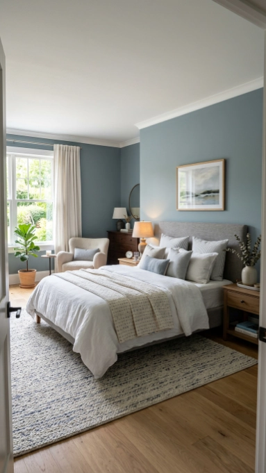
16. Mineral Blue and Muted Blue-Gray (Wedgewood Gray BM / Stonington Gray BM)

Real, saturated blue is taking a back seat in 2026. What’s staying strong is soft, subtle blue-gray blends that sit somewhere between blue and gray without committing to either.
Benjamin Moore’s Wedgewood Gray and Stonington Gray are two of the most versatile options here. They’re complex enough to look considered but gentle enough to work as a backdrop for almost any furniture style. Blue-greens are preferred over blue-purples in this category.
Best paired with: Crisp white trim, natural wood floors, navy or forest green accents. Light direction: South and west-facing rooms for a cooler, collected feel.
17. Night Groove (Clare): Aubergine for a Luxe Bedroom Cocoon

Aubergine and dusty purple are making a genuine move in 2026 bedroom design. Night Groove by Clare is a lush, deep aubergine that brings drama and dimension. Used on all four walls, it creates the “cocoon” effect that has become one of the defining bedroom aesthetics of the year.
The version that works long-term is the one with brown or gray in it. Pure purple reads theatrical. Dusty, muted aubergine reads luxurious and timeless. Pick the muddier one.
Best paired with: Warm cream bedding, gold or brass accents, deep wood tones. Finish: Matte keeps the drama from tipping into shiny excess.
See also: 33 Cozy Black Boho Bedroom Ideas You’ll Love
18. Cosmic Vibes (Clare): Dusty Purple for Those Who Want Color Without Commitment

Cosmic Vibes is a step down from Night Groove in saturation. It’s a medium dusty purple that reads lavender in some lights and mauve in others. For someone who wants color personality in their bedroom without going full moody-dark, this is the sweet spot.
It layers beautifully with other pale shades and works well in the “layered neutrals plus color pops” approach that Benjamin Moore’s 2026 palette specifically recommends.
Best paired with: Pale blush accents, warm white trim, light natural wood. Light direction: North and east-facing rooms where the subdued light keeps it from washing out.
19. Oxblood / Deep Burgundy (Vintage by Clare / Electric Bowery by BM): The Statement Shade Done Right

Burgundy and oxblood have been one of the hottest colors in both fashion and home design going into 2026. On a bedroom wall, done right, they’re deeply satisfying. Done wrong, they’re a commitment you’ll regret in 18 months.
The key is low contrast. Pair a deep burgundy wall with dark wood tones, and the visual noise drops. Use creamy highlights rather than bright white for trim. The Vintage shade from Clare gives a rich, timeless red-wine quality. Electric Bowery from Benjamin Moore is the slightly darker, more dramatic alternative.
Best paired with: Dark walnut furniture, cream or warm white bedding, amber lighting. Avoid: Bright white trim (too much contrast), cool-toned metals.
20. Alabaster (Sherwin-Williams): The Warm White That Looks Like Sunshine Through a Curtain

Warm whites are not boring. The right warm white is one of the best things you can put on a bedroom wall, because it works at every hour of the day and with every style of furniture.
Alabaster from Sherwin-Williams sits between white and off-white with a cream undertone that never reads yellow but always reads warm. It works on all four walls and on trim simultaneously, creating a seamless, airy look that lets textures and materials do the decorating.
Interior designers who use this shade consistently report that clients describe the room as feeling like “morning air.” That’s exactly the goal for a bedroom.
Best paired with: Literally everything. It’s the most versatile pick on this list. Finish: Eggshell for walls (easy to clean, slight warmth from the sheen), flat or matte for trim.
21. The Ceiling Color Trick: Dark Ceilings and the “Goodnight Moon” Effect

Most people paint their ceiling white and forget about it. That’s a missed opportunity, and 2026 bedroom design is making a strong case for changing that.
Painting a bedroom ceiling in a deep inky blue, like Goodnight Moon from Clare, creates instant drama without overwhelming the walls. It’s the sensation of sleeping under the night sky without the impracticality of it.
You don’t have to go full dark navy either. Taking the wall color 30% deeper for the ceiling adds depth and makes the room feel considered. Alternatively, Benjamin Moore recommends the “+5% lighter” ceiling rule: paint the ceiling in the same hue as the walls, but five LRV points lighter. It creates visual continuity without the room feeling flat.
“Color capping” (painting the upper portion of walls and ceiling a different shade) and full ceiling color are two of the more talked-about bedroom paint moves of 2026.
Try it with: Night Groove on the ceiling above neutral walls. Or Midnight Garden on the ceiling above cream walls. Both create a truly special bedroom.
22. Color Drenching: One Color Everywhere, Including the Trim

Color drenching means you pick one color and commit. Walls, trim, ceiling. Everything the same shade, or the same shade across a very narrow tonal range.
The effect is surprisingly calming rather than overwhelming. Without visual competition between wall and trim, everything settles. The room feels more like a room and less like a collection of surfaces. The complete guide to living room decor goes into detail on how to build a cohesive interior color approach across rooms if you want to take this further.
The best shades for color drenching in a bedroom: warm sandy neutrals, soft sage green, warm greige. These colors have enough complexity to read differently in different lights, which keeps the monochrome from feeling flat.
Designer move: Color drenching works especially well in smaller bedrooms where you want to stop the eye from bouncing around and just let the room breathe.
Quick Reference: All 22 Bedroom Paint Colors at a Glance
| # | Color Name | Brand | Category | Best For | Pairs With |
|---|---|---|---|---|---|
| 1 | Universal Khaki | Sherwin-Williams | Sandy Neutral | Any bedroom style | Cream, oak, brass |
| 2 | Turbinado | Clare | Warm Earthy Neutral | Cozy, layered rooms | Warm white trim, terracotta |
| 3 | Daily Greens | Clare | Earthy Green | Calm, restful spaces | Linen, walnut, warm white |
| 4 | Sage Green (Pigeon / Tea Green) | F&B / Edward Bulmer | Soft Sage | Identity + coziness | Warm neutrals, rattan |
| 5 | Silhouette AF-655 | Benjamin Moore | Deep Moody Brown | Accent/feature wall | Soft whites, muted greens |
| 6 | Midnight Garden | Dunn-Edwards | Deep Botanical Green | Light-filled bedrooms | White trim, linen, brass |
| 7 | Warm Mahogany | Glidden | Spiced Brown-Red | Cocooning, intimate feel | Dark wood, cream, amber light |
| 8 | Clove / Middlebury Brown | SW / BM | Warm Brown | Character-driven rooms | Cream, brass, leather |
| 9 | Warm Terracotta | Various | Clay Earthy Tone | Warm, grounded style | Sage green, jute, linen |
| 10 | Chocolate Brown (Willow / Clove) | BM / SW | Deep Brown | Accent walls | Cream, green plants, amber |
| 11 | Wing It | Clare | Pink-Neutral Blush | Soft, grown-up feminine | Cream, warm white, rattan |
| 12 | Subrosa | Clare | Warm Rose | Quiet luxury feel | Aged brass, cream bedding |
| 13 | Lavender Mist / pale lavender | Various | Soft Lavender | Sleep quality + calm | White bedding, light wood |
| 14 | Hidden Gem | Behr | Earthy Blue-Green | Full room wrapping | Warm neutrals, natural wood |
| 15 | Sea Salt SW 6204 | Sherwin-Williams | Soft Blue-Green | Small or medium bedrooms | Linen, driftwood, chrome |
| 16 | Wedgewood / Stonington Gray | Benjamin Moore | Muted Blue-Gray | Classic, versatile rooms | White trim, natural wood |
| 17 | Night Groove | Clare | Deep Aubergine | Bold, cocoon-style rooms | Cream, gold, deep wood |
| 18 | Cosmic Vibes | Clare | Dusty Purple | Medium color commitment | Pale blush, warm white |
| 19 | Vintage / Electric Bowery | Clare / BM | Oxblood / Burgundy | Statement bedroom | Dark wood, cream, amber |
| 20 | Alabaster SW 7008 | Sherwin-Williams | Warm White | Any room, any style | Everything |
| 21 | Goodnight Moon (ceiling) | Clare | Inky Blue Ceiling | Ceiling drama effect | Neutral walls, any style |
| 22 | Color Drenching (tone-on-tone) | Any brand | Design Technique | Small or intimate rooms | Works across all neutrals |
Colors That Are Out in 2026 (And What to Swap Them For)
Knowing what to skip saves you from a repaint in 18 months. Here’s the quick guide:
| Out in 2026 | Why It’s Fading | Swap It For |
|---|---|---|
| Cool gray (icy, blue-undertone) | Feels cold and uninviting in rest spaces | Warm greige, sandy khaki, warm taupe |
| Icy blue pastel | Reading as dated; lacks emotional depth | Earthy blue-green (Hidden Gem, Sea Salt) |
| Saturated dusty blush pink | Four years on walls = overexposed | Wing It, Subrosa, warm pink-neutral |
| Dark jewel-tone accent walls (electric versions) | “Visually tiring” over time | Oxblood, aubergine, earthy botanical green |
| Pure, icy white (high LRV above 80) | Over-stimulates before sleep | Alabaster, Neutral Ground, Creamy |
| Cool-toned purple (lavender-leaning electric) | Too sweet, too trendy | Cosmic Vibes, dusty plum, muted aubergine |
As designers put it, 2026 rooms need a point of view. “Commit to the sage, commit to the blush, commit to the terracotta. Just don’t commit to the color that tries to be everything and ends up being nothing.”
How to Choose the Right Color for Your Specific Bedroom
After years of looking at trend reports and before-and-after rooms, a few things consistently make or break a bedroom paint decision.
Start with natural light. This is the single biggest variable. A warm terracotta in a north-facing room can look muddy and heavy. The same shade in a south-facing room with afternoon light? Rich and beautiful. Match the warmth or coolness of your light to the undertone of your color.
Understand undertones before you buy. Hold the swatch against pure white paper. This reveals the hidden undertone. A “gray” with warm brown undertones reads completely differently from one with cool blue undertones. This is the source of most “I thought this would be gray and now it looks green” regrets.
Test on a large patch before committing. Paint a section at least 12 x 12 inches on the actual wall (not the swatch card). Look at it in morning light, noon light, and lamplight at night. Colors shapeshift significantly through the day.
Match finish to function. Matte finishes absorb light and make colors look deeper and more complex. Eggshell adds a subtle sheen that brightens and cleans up more easily. For most bedrooms, eggshell on walls is the practical choice. Matte on ceilings.
Use the 60-30-10 rule as a starting point. 60% dominant color (walls), 30% secondary color (upholstery and larger textiles), 10% accent color (pillows, art, hardware). It’s a formula that produces balance without feeling calculated.
If you’re updating other rooms at the same time, the principles translate well across spaces. For living areas, the complete guide to living room decor covers color palette building in a way that works alongside these bedroom approaches.
Key Takeaways
- The dominant theme of 2026 bedroom color is warmth. Cool grays, icy blues, and cold pastels are all declining. Earthy, warm, and grounded shades are replacing them across every major paint brand’s trend forecasts.
- Earthy greens are the headline color category. Sage, botanical green, and blue-green with warm undertones are the most specified bedroom colors going into 2026. They’re backed by sleep science as well as design trends.
- Warm neutrals have evolved. Sandy khaki and warm taupe have replaced cool gray as the safe, classic bedroom neutral. Universal Khaki, Turbinado, and Alabaster are the shades to know.
- LRV between 45 and 65 is the 2026 sweet spot for bedrooms. Light enough to feel airy in the morning, deep enough to support rest at night.
- Dark colors work best on the headboard wall only. For moody shades like Silhouette, Midnight Garden, or Night Groove, the feature wall approach lets you get the drama without the heaviness of four dark walls.
- Warm whites beat icy whites for sleep spaces. Pure white above LRV 80 over-stimulates the eye. Alabaster, Neutral Ground, and soft cream versions with LRV 75-82 with warm undertones are the better choice.
- Technique matters as much as color. Color drenching (walls, trim, ceiling one shade), color capping, and the painted ceiling are three of the most designer-specified bedroom paint moves of 2026.
- Always test the color in your actual room. Swatches lie. Light, room size, and existing materials all change how a color reads.
Your bedroom is the room you wake up in and the last thing you see at night. It deserves a color that actually does something for you. And right now, whether you go warm and sandy neutral, deeply earthy green, or moody aubergine, the options have never been better matched to what a sleep space should feel like.