
Decorating an open floor plan comes with a real challenge: too much space with no walls means everything is visible at once. Get the layout or color palette wrong, and the whole space looks like one large, unfinished room. These 50 open floor plan decoration ideas cover zoning, furniture placement, lighting, color, and texture, giving you specific solutions for the most common problems homeowners face in open-concept spaces.
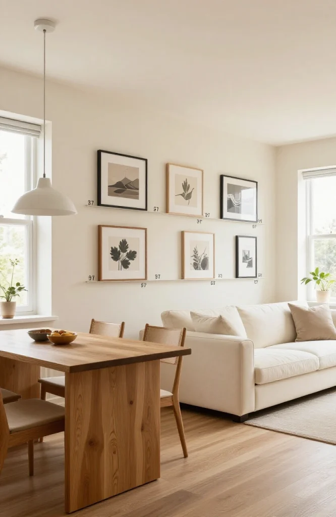
1. Use Area Rugs to Define Each Zone

Place a separate area rug under each functional area: living room, dining space, and kitchen seating. Each rug acts as a visual floor plan within the larger room. Choose rugs in the same color family but with different patterns or textures to keep them distinct without clashing. For sizing, the living room rug should be large enough that the front legs of every seating piece rest on it, and the dining rug should extend at least 24 inches beyond the table on all sides so chairs stay on the rug when pulled out.
2. Float Your Furniture Away From the Walls
Pushing all sofas and chairs against the walls leaves a dead center and makes the space feel like a waiting room. Pull furniture inward to form a tight conversation group. This creates a defined living zone and leaves intentional negative space around it. A common concern is that floating furniture will block walkways, but keeping a minimum 36-inch clearance on primary paths solves that without pushing everything back to the perimeter.
3. Choose a Single Consistent Color Palette
Pick two or three base colors and carry them through every zone. This doesn’t mean everything matches, it means nothing fights. A warm white wall, a natural oak floor, and a dusty blue sofa can work across kitchen, dining, and living areas without feeling repetitive. The risk in open-plan spaces is introducing too many accent colors across zones, which makes the space read as several rooms pasted together rather than one cohesive home.
4. Repeat Accent Colors Across Zones
Once you select an accent color, repeat it in at least three different spots: a throw pillow in the living area, a vase on the dining table, a bowl on the kitchen counter. This creates visual rhythm and makes the space read as one intentional design rather than separate rooms. Spacing those repetitions evenly across the entire room, rather than clustering them in one zone, does the most work for visual cohesion.
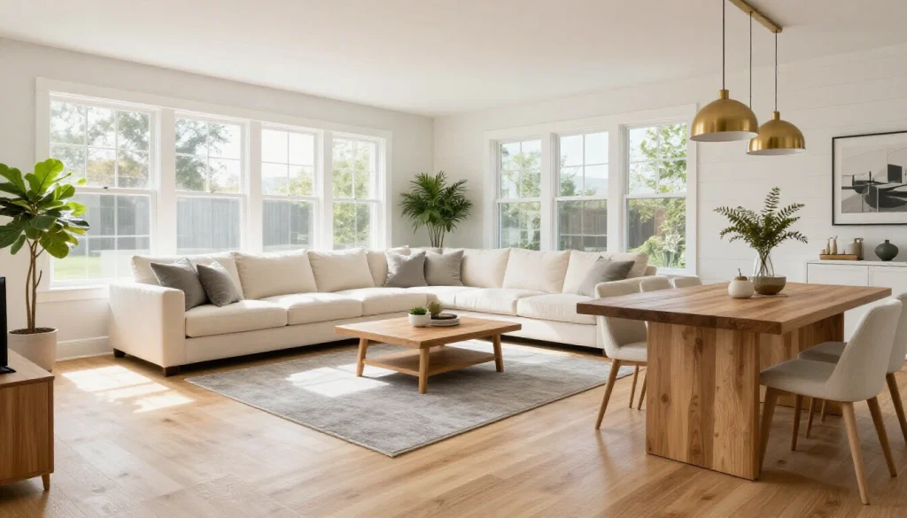
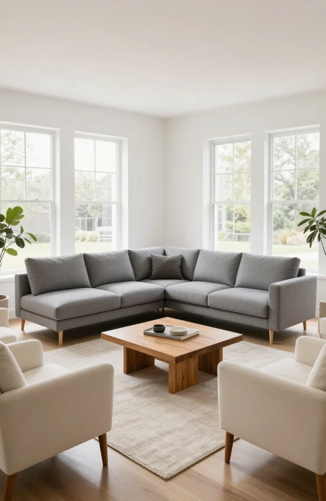
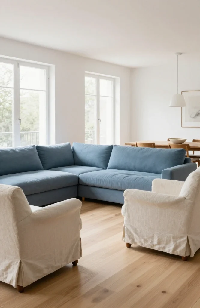
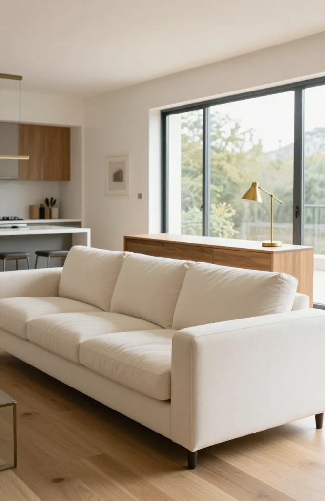
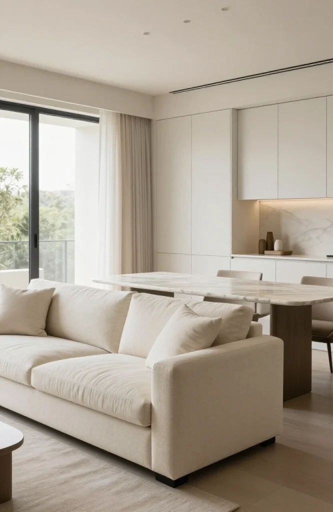
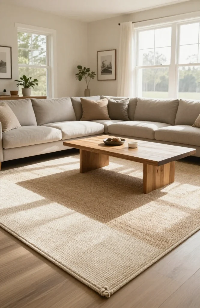
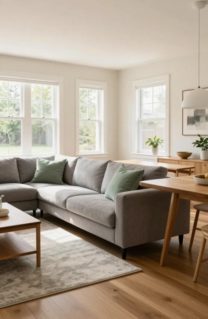
5. Use a Large Sectional to Anchor the Living Zone
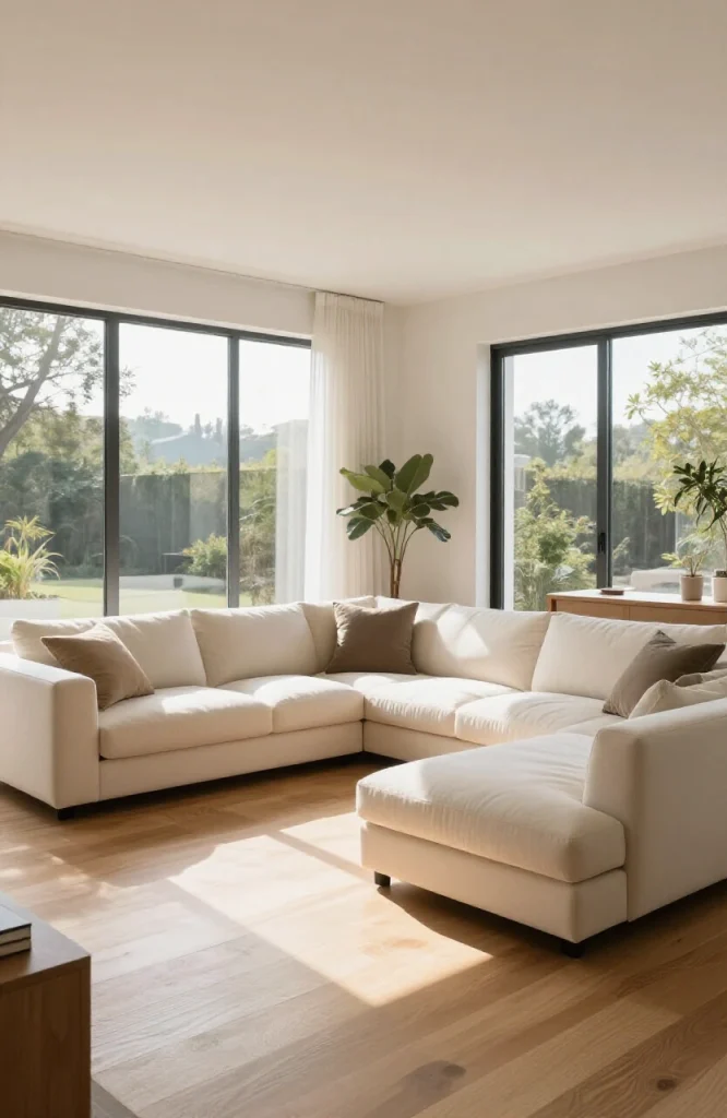
In a big open space, a standard three-seater sofa can look lost. A large L-shaped sectional defines the living area without needing walls. It creates a natural perimeter for the zone and signals to anyone entering exactly where the “living room” is. For more placement guidance, see our guide to modern L-shaped sofa ideas.
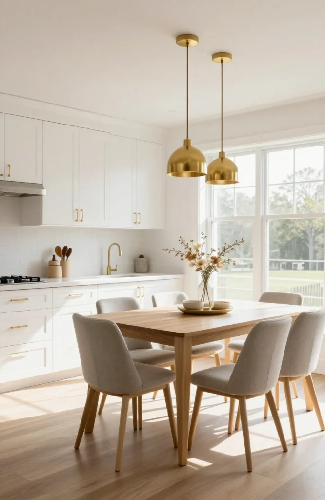
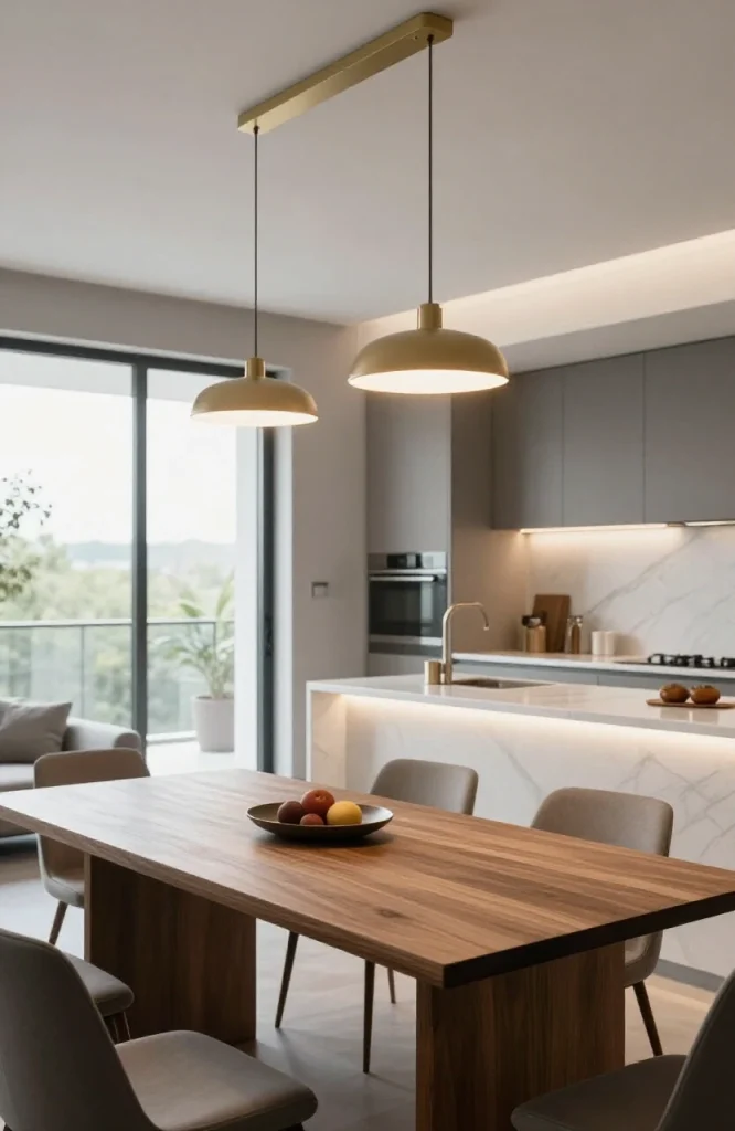
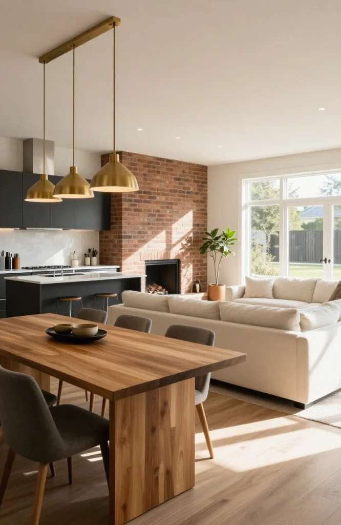
6. Hang Pendant Lights Over the Dining Table
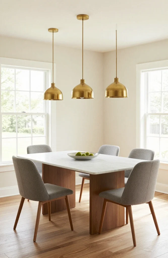
Pendant lights serve two purposes: they provide task lighting and they visually “claim” the space below as the dining zone. The fixture doesn’t need to be large, but it should hang low enough, around 30 to 34 inches above the table, to feel connected to the surface beneath it. If you’re working with a longer rectangular table, a row of two or three smaller pendants spaced evenly creates more consistent light distribution than a single large fixture. Keep the cord or rod length identical across all pendants in a grouping so they read as a unified installation rather than a mismatched collection.
7. Install a Chandelier or Statement Light in the Living Area
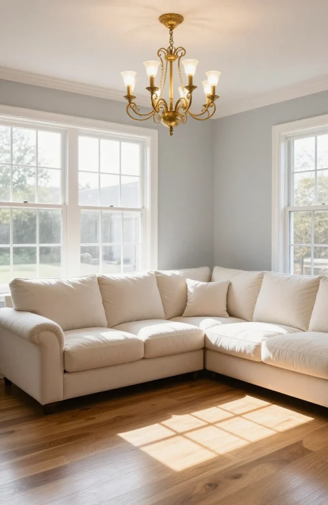
Similar to the dining pendants, a ceiling fixture centered over the seating area marks the zone. Track lighting or recessed lighting alone won’t do this, as they don’t have the visual weight. A statement fixture makes the zone feel anchored from above. As a general sizing guideline, add the room’s length and width in feet and that number in inches gives you a reasonable chandelier diameter for the space. A living area that measures 14 by 16 feet suits a fixture around 30 inches wide.
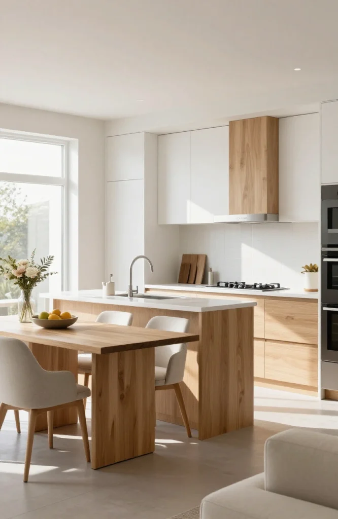
8. Use a Kitchen Island as a Zone Boundary
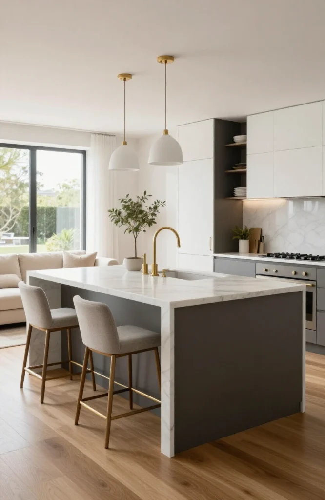
A kitchen island acts as a natural barrier between the cooking and living areas. It doesn’t close the space off but creates a transition point. Bar stools on the living-room side give people a place to sit close to the kitchen without being in it. For the transition to feel intentional rather than accidental, choose island pendant lights that share a metal finish with fixtures elsewhere in the space.
9. Add a Half-Wall or Pony Wall Between Kitchen and Living Areas
A pony wall, typically 36 to 42 inches high, breaks the sightline just enough to separate cooking mess from the living area without blocking light or conversation. You can top it with a shelf for plants, books, or decorative objects that look good from both sides. Capping the pony wall in a contrasting material, such as a wood ledge on a painted drywall wall, gives it a finished look and makes the shelf more functional. This also gives you a surface to run low-voltage lighting along, which adds warmth to both zones at once.
10. Install Open Shelving as a Room Divider
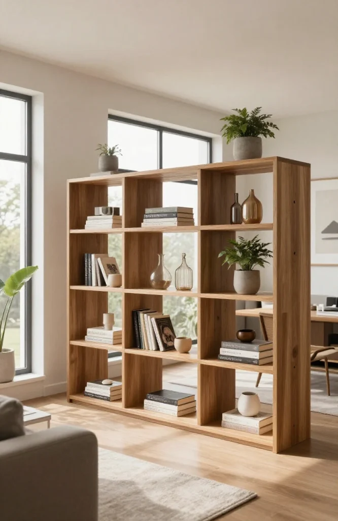
A freestanding bookcase or open shelving unit placed perpendicular to a wall functions as a soft divider. Style it with books, plants, and objects that look good from both sides. Keep it at chest height or lower to maintain sight lines across the room. For kitchen-specific ideas, see our open shelving kitchen ideas.
11. Use a Sofa Back to Create a Boundary
When an L-shaped sectional isn’t the right fit, a standard sofa with its back facing the dining or kitchen zone works as a visual divider. Add a narrow console table behind the sofa for lamps or decor, which reinforces the boundary and adds function. The console should be no deeper than 14 to 16 inches so it doesn’t eat into walkway space, and ideally sits at the same height as the sofa back or slightly above it, so lamps anchor the boundary without overwhelming the view from the dining side.
12. Hang Curtains Between Zones for Flexible Privacy
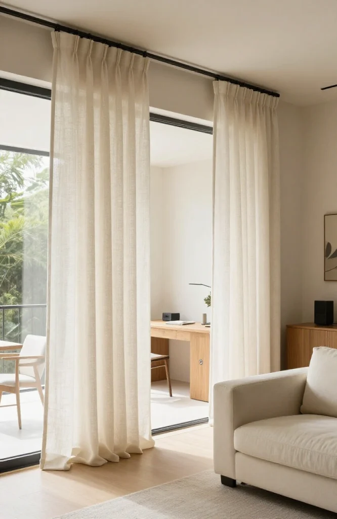
Floor-to-ceiling curtains on a ceiling-mounted track can section off areas when needed, such as a home office from a living room, and slide open when you want the space to flow. Use a fabric that works with the rest of the room’s palette rather than a contrasting drapery panel. A medium-weight linen or cotton blend works better than blackout fabric in this application because lighter fabric lets some light pass through when closed, maintaining the sense of space rather than completely walling off one area.
13. Match the Kitchen and Living Room Flooring
Using the same flooring material across the entire open plan gives visual continuity. If you already have different floors, add a large area rug in the living zone so the transition point is blurred and the shift in materials becomes intentional-looking. Another option when floors can’t be changed is to use a transition strip in a material that complements both surfaces, such as a brass strip between wood and tile, turning a practical necessity into a subtle design detail.
14. Use a Statement Wall in One Zone Only
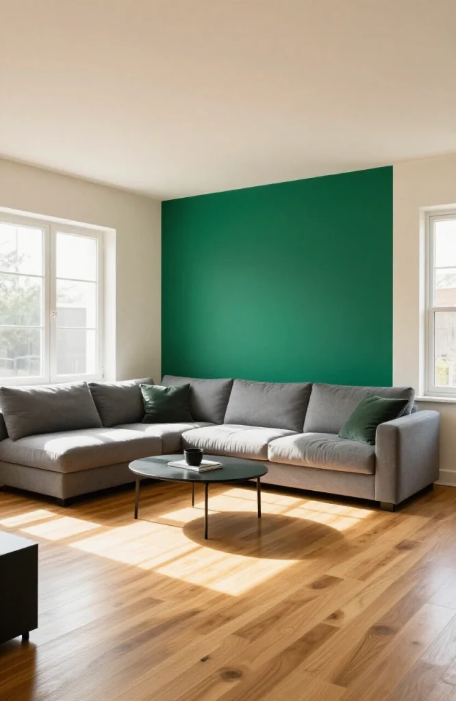
If every zone has a feature wall, they compete. Pick one, usually behind the sofa or the dining area, and give it the special treatment: paint, wallpaper, or a gallery arrangement. The other walls stay neutral, which gives the eye a place to land without the space feeling busy. In open-plan spaces, the living zone statement wall tends to have the most impact because it is typically the first wall visible from the entry point.
15. Keep Cabinet and Furniture Heights Consistent
In an open-concept kitchen, dining, and living space, varying furniture heights create visual noise. Aim for a consistent line across cabinets, bookshelves, and large furniture. This doesn’t mean everything is the same height, as you’ll have low seating, mid-height dining, and upper cabinets, but keep the tallest pieces at the perimeter and lower pieces in the center. A simple way to check this is to photograph the space from the main entry point and look at whether the tallest pieces create an orderly backdrop or a chaotic skyline across the room.
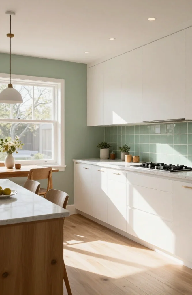
16. Add a Kitchen Backsplash That Anchors the Cooking Zone
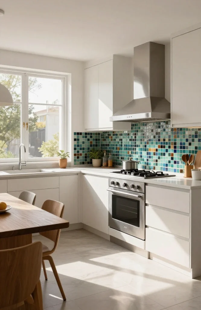
A strong backsplash ties the kitchen to itself rather than letting it bleed visually into the rest of the space. Subway tile, zellige, or patterned ceramic all work well. The backsplash treatment signals “this is the kitchen” even without a wall separating it. For kitchen counter surface options that complement this approach, see marble countertop alternatives.
17. Create a Dining Nook With a Banquette
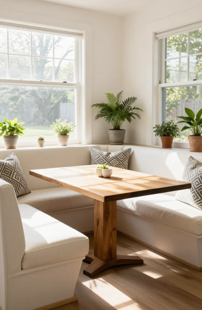
A built-in banquette with an L-shaped bench and a fixed table carves out a dining zone with defined edges. Because the banquette is built into a corner, it creates enclosure on two sides without any walls. This works especially well in smaller open-plan homes where a large dining table would feel overwhelming. Standard banquette seat height is 18 inches, and the table should sit at 30 inches for comfortable dining, with the seat cushion no thicker than 3 to 4 inches to keep knee clearance comfortable.
18. Use a Kitchen Cart or Bar Cart as a Mobile Divider
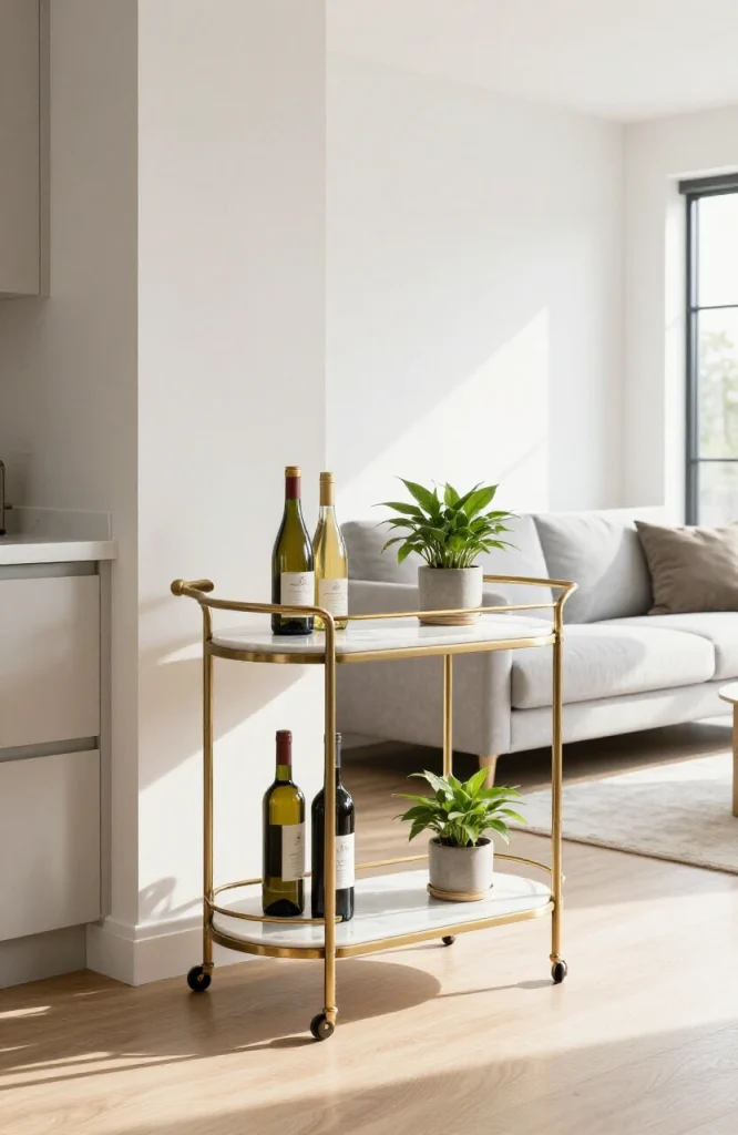
A substantial bar cart or kitchen island cart can mark a zone boundary and move when needed. This is useful in rental spaces or homes where flexibility matters. Style it with items that make it look intentional, such as a wine rack, glassware, and a small plant, rather than like overflow kitchen storage. A cart with locking wheels adds stability when it serves as a semi-permanent divider and rolls easily when you need the footprint back for entertaining or cleaning.
19. Place a Console Table Behind the Sofa
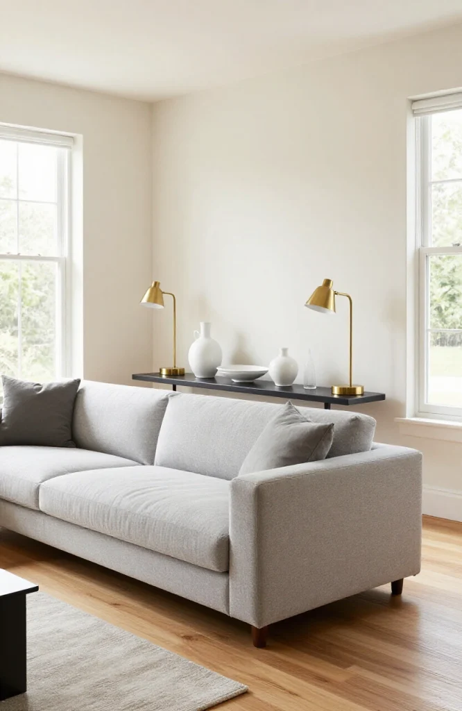
A narrow console table behind the sofa serves as a mini-zone boundary while adding a surface for lamps and decor. It reinforces the edge of the living area and gives the sofa a visual backstop rather than leaving it floating in the middle of the room with nothing behind it. Pair the console with two matching table lamps to frame the sofa symmetrically, which strengthens the boundary between living and dining zones and adds warm, layered light to the seating area.
20. Use Tall Plants to Separate Spaces
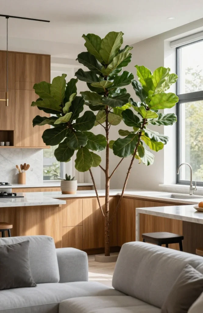
Large floor plants, such as fiddle-leaf figs, palms, and olive trees, add height and texture and can function as soft zone dividers. A grouping of three tall plants at the boundary between kitchen and dining, for example, creates a natural-feeling visual break without any hard structure. For maximum effect, vary the heights within the grouping rather than placing three plants of identical size. A taller centerpiece flanked by two slightly shorter plants creates more visual interest and fills vertical space more naturally than a uniform row.
21. Hang a Statement Art Piece to Mark a Zone
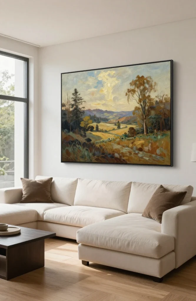
One large piece of art on a specific wall declares that wall as the focal point of that zone. In an open plan, you need each zone to have its own focal point. A large canvas or print above the sofa or behind the dining table does this immediately. For the piece to read as a true statement in a large open-plan space, aim for a width that covers at least two-thirds of the furniture below it. An art piece that is too small for the wall scale looks decorative rather than anchoring, which defeats the purpose in a space where strong visual signals are needed to define zones.
22. Use Matching Hardware Throughout Kitchen and Dining
When kitchen hardware, light fixtures, and dining furniture legs share the same metal finish, such as brass, matte black, or brushed nickel, the two zones feel connected. This subtle material repetition works across the entire open space without requiring any structural changes. Matte black is one of the most versatile options because it reads as neutral in a wide range of palettes, while brass works well in warmer schemes and brushed nickel suits cooler, more contemporary interiors.
23. Incorporate Ceiling Treatments to Define Zones
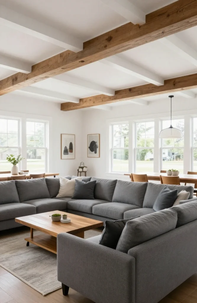
A coffered ceiling, a painted ceiling section in a different color, or a wood beam treatment over one area creates an “invisible room” above the furniture. The ceiling zone matches the floor zone below, and the definition becomes architectural rather than relying entirely on furniture placement. If a full coffered ceiling isn’t in the budget, applied ceiling beams, which are hollow boxes rather than structural elements, achieve the same visual result at a fraction of the cost and can be installed without professional contractors in most cases.
24. Use Different Lighting Temperatures for Each Zone
Warm-white bulbs (2700K–3000K) suit the living area; cooler, brighter lighting (3500K–4000K) works better over the kitchen prep area. The shift in lighting temperature marks the zones functionally and creates atmosphere in the living space without making the kitchen feel dim. For a full guide, see our home office lighting ideas post, as many of the same principles apply.
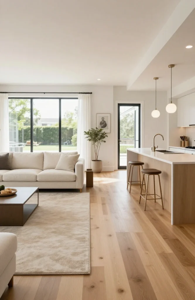
25. Keep a Unified Window Treatment Across All Windows
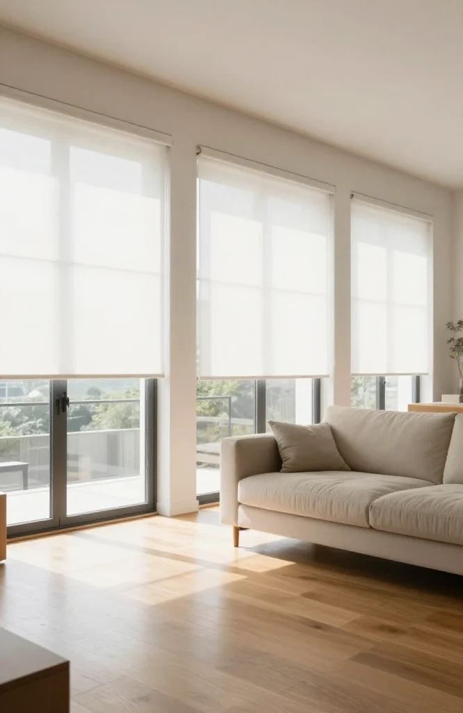
Matching curtains, blinds, or shutters across every window in the open plan creates a consistent border at the perimeter of the space. If you use different window treatments in different zones, the room reads as fragmented. One uniform treatment ties the whole space together even when the zones below differ. Where practicality requires different levels of privacy or light control in different areas, use the same fabric or slat style but with different opacity levels rather than completely different treatment styles.
26. Use Contrasting Textures Rather Than Contrasting Colors
Instead of changing colors between zones, change textures. A linen sofa, a marble dining table, and matte-finish cabinets can all work in the same neutral palette while feeling visually distinct from each other. Texture variation adds richness without the risk of color conflict. Pairing rough and smooth surfaces is more effective than mixing multiple rough textures: a nubby boucle chair alongside a polished concrete floor, or a raw-edge wood table next to smooth lacquered cabinetry, reads as intentional contrast rather than inconsistency.
27. Add a Room Divider Screen for Flexible Separation
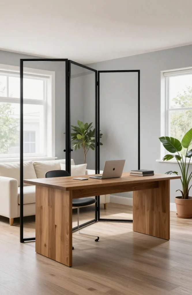
A folding screen or room divider panel creates a temporary zone boundary and can be stored when not needed. Use it to close off a home office area from the living space during work hours, then fold and store it when the full open plan is wanted again. A four-panel screen in rattan or woven material adds texture and warmth while blocking sightlines, whereas a lacquered or mirrored screen works better in more minimal or contemporary interiors. Aim for a screen height of at least 68 to 72 inches so the divider actually obscures the area behind it rather than just marking a boundary at eye level.
28. Create a Gallery Wall to Anchor the Dining Zone
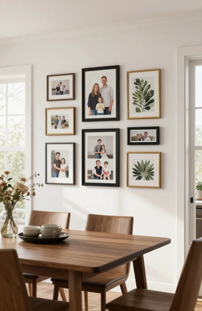
A gallery wall arrangement centered above the dining table or along the dining zone wall claims that wall for the dining area. Use a mix of frame sizes but keep the frame finish consistent. This is a lower-cost way to create a strong visual anchor than large-scale artwork or wallpaper. Lay out the arrangement on the floor before hanging to test the composition, and keep gaps between frames tight, typically 2 to 3 inches, so the arrangement reads as a unified installation rather than a scattered collection.
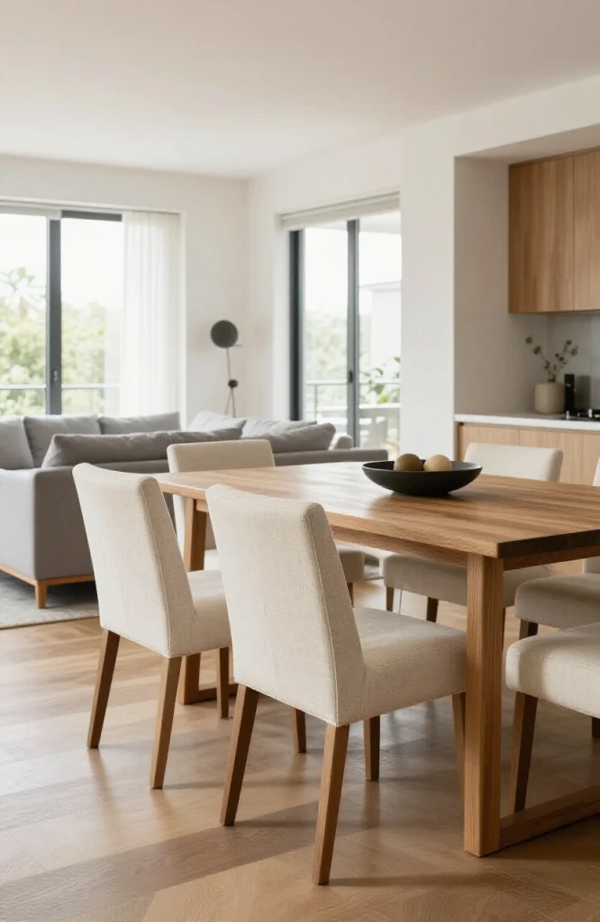
29. Use a Kitchen Dining Table in a Different Style From the Living Furniture
Choosing a dining table in a different material or style from the living room sofa helps the two zones read as distinct spaces despite sharing a room. A marble dining table and a fabric sofa occupy the same palette but feel like different zones within the same space. The key is to differentiate by material category rather than just color: wood versus upholstery, stone versus fabric, metal versus rattan. Color alone isn’t enough to separate zones without a material shift to back it up.
30. Add a Window Seat to Define a Reading Nook
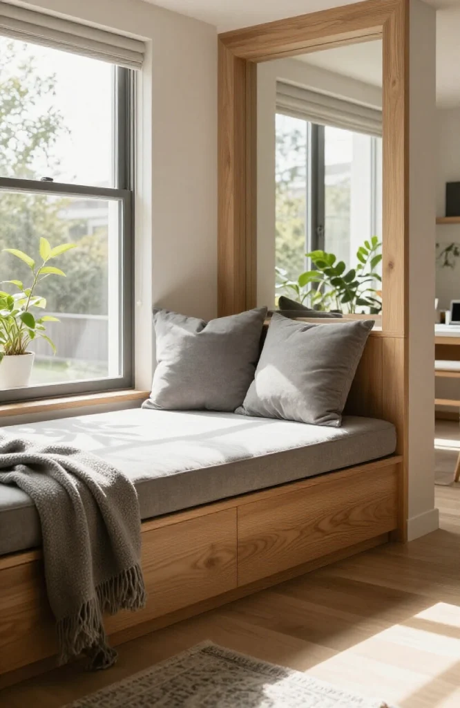
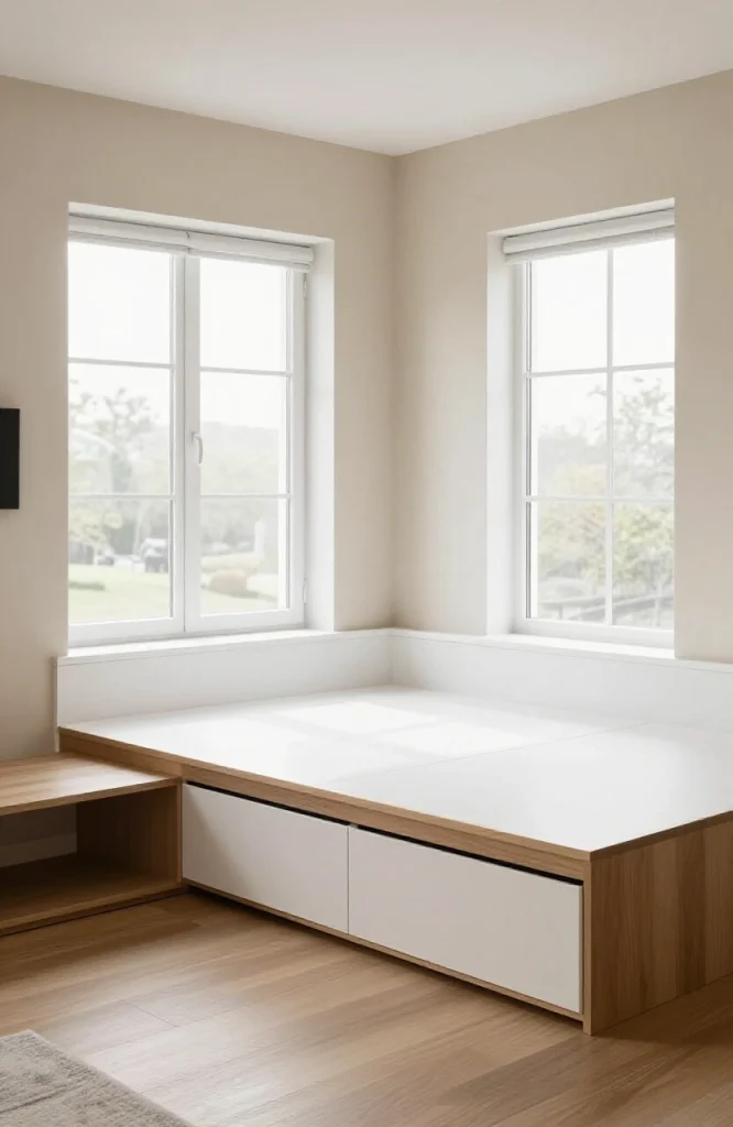
A built-in window seat with cushions and storage below creates a semi-enclosed mini-zone within the open plan. It signals “this is a quiet spot” visually and gives people a reason to sit away from the main seating area. Even in a large open-plan space, a window seat feels cozy and intentional. A seat depth of 18 to 24 inches is comfortable for both sitting and lying, and adding a full-height bookshelf on one or both sides turns the nook into a proper reading alcove with a sense of enclosure.
31. Match the Dining Chairs to the Living Room Accent Color
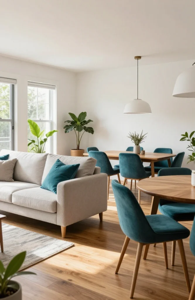
Using dining chairs in the same color as the living room throw pillows or accent chair ties the two zones together. It is one of the simplest ways to create cohesion without changing anything structural. A navy dining chair and a navy throw pillow across the room form a visual line. This technique works because the eye naturally connects matching colors across a space, creating continuity without requiring architectural elements to do the bridging.
32. Use a Kitchen Hood as a Design Statement
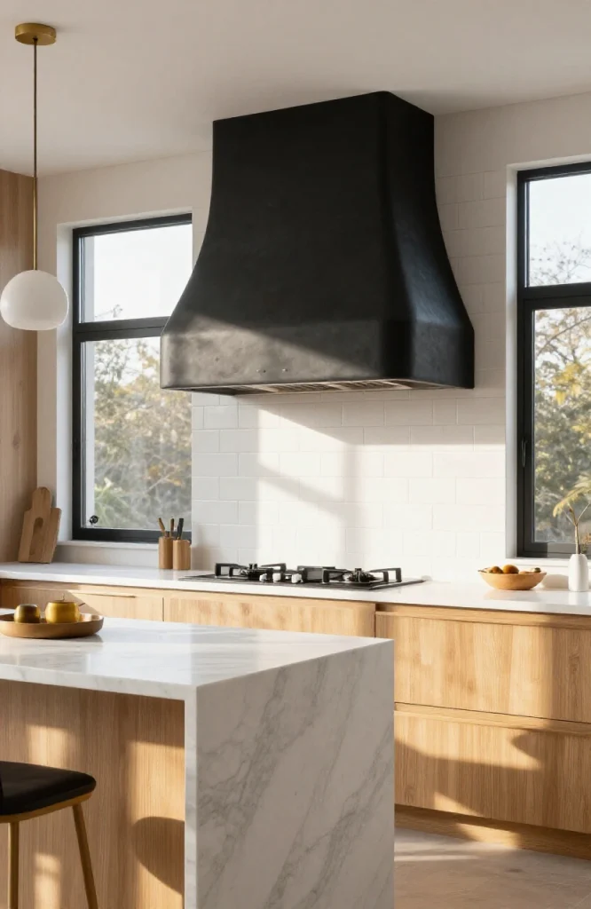
In an open-plan space, the range hood is visible from nearly every angle. A custom plaster hood, a painted wood hood, or a bold metallic hood turns a functional item into a feature. It marks the cooking zone clearly and gives the kitchen a defined centerpiece even without upper cabinets. If replacing the hood isn’t practical, painting the existing one to match the cabinetry, or wrapping it in the same tile as the backsplash, integrates it into the kitchen design rather than leaving it as an afterthought.
33. Add a Kitchen Bench Along One Wall
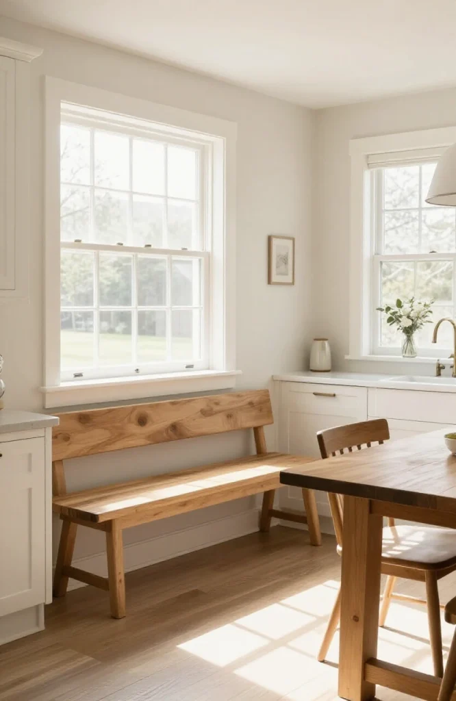
A bench against the kitchen wall, or at one side of the dining table, softens the cooking zone and creates a transition point between kitchen and dining. It also provides flexible seating that feels more casual than standard dining chairs, which suits open-plan homes used for entertaining. A bench with built-in storage underneath is a practical choice in open-plan kitchens where cabinet space is limited, since it handles overflow items while contributing to the zone’s visual organization.
34. Use Mirrored or Glass Furniture to Keep the Space Light
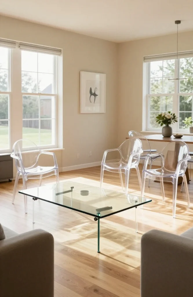
In an open-plan space that feels heavy or overfurnished, glass or acrylic furniture, such as a glass coffee table or acrylic dining chairs, reduces visual bulk. These pieces define zones without adding visual weight, and the space feels more open even with the same amount of furniture. This approach works especially well in narrow open-plan layouts where furniture arranged across the width of the room can make the space feel compressed, since transparent pieces maintain visual flow from one end to the other.
35. Incorporate Architectural Details to Create Zone Identity
Wainscoting in the dining zone, beadboard in the kitchen, or board-and-batten in the living area gives each zone its own “character wall” without paint or wallpaper. These treatments can be painted the same color as the rest of the room, so they’re subtle but still zone-defining. Standard wainscoting height runs from 32 to 36 inches in dining rooms and up to 48 inches in more formal settings. At the same paint color as the upper wall, the texture alone creates the visual definition without adding a color break.
36. Zone With Ceiling Color Rather Than Wall Color
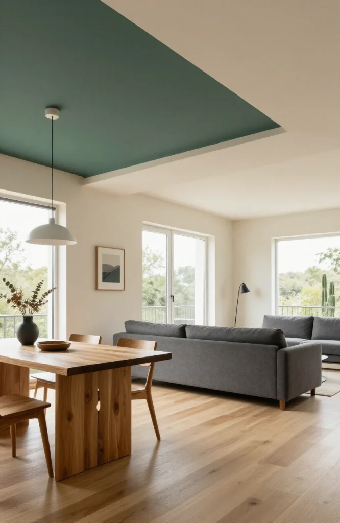
Painting the ceiling above each zone a different shade, slightly darker in the dining zone and lighter in the living area, creates zone definition from above without touching the walls. This works particularly well in homes where the architecture makes wall color changes look awkward. A shift of 20 to 30 percent in depth on the same base paint color is usually enough to read as distinct at ceiling height without feeling dramatic. Going too dark above a single zone can make that area feel lower than it is, so test with a sample before committing.
37. Use a Long Dining Bench on One Side of the Table
A bench seat on one side of the dining table instead of chairs on both sides signals “dining zone” and faces outward toward the living area, maintaining visual connection. Benches also take up less visual space than four individual chairs, which matters in open-plan rooms with sightlines from every direction. A bench that runs the full length of the table side, rather than stopping short at both ends, gives the dining area a clean horizontal line that reads well from across the room.
38. Hang Artwork at a Consistent Height Across All Zones
Picture rail height, typically 57 to 60 inches from floor to center, creates a horizontal line across the entire open-plan space. When artwork in the dining, living, and even kitchen areas hangs at the same height, the eye follows that line across the room and the space reads as unified. The 57-inch center-of-artwork standard comes from average human eye height and is used in most gallery installations for exactly this reason. In open-plan spaces with high ceilings, some designers raise this to 60 or 62 inches to avoid artwork appearing to float too low relative to the ceiling volume.
39. Create a Home Office Nook With a Defined Desk Area
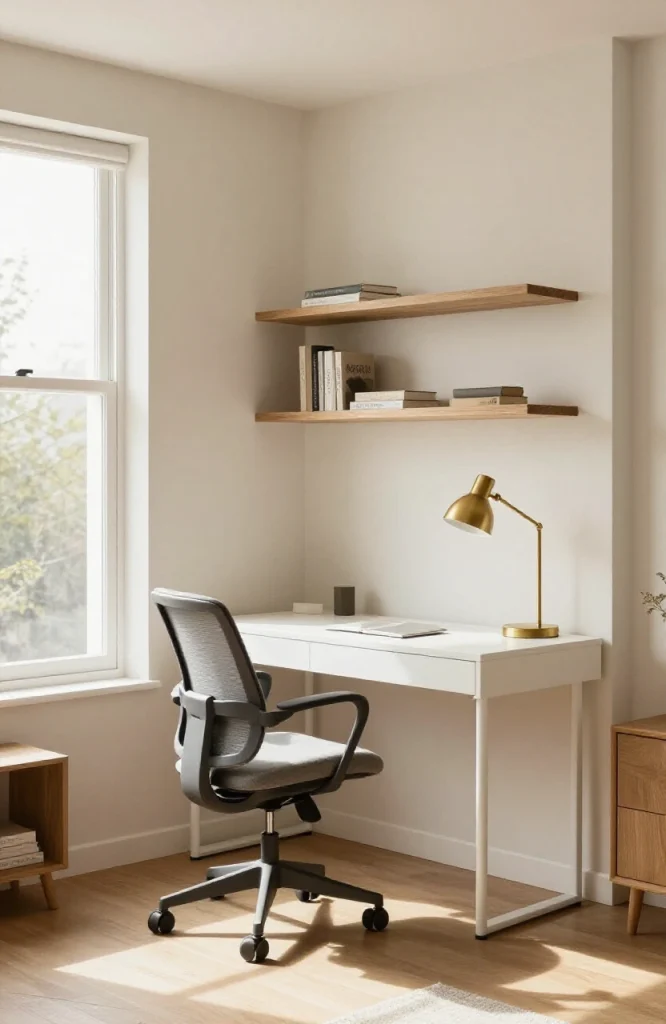
A small desk with a chair and a task lamp, tucked into a corner of the open-plan space, creates a working zone. Add a small bookshelf or shelving unit behind the desk to give it a sense of enclosure. This nook doesn’t need a door, it just needs enough visual definition to feel separate from the living area. Positioning the desk so it faces a wall rather than the living space reduces visual distraction during work and gives the nook a clear sense of inward orientation, making it feel like a functional zone rather than a desk that happens to be in the corner.
40. Use a Kitchen Backsplash Tile That Connects to the Living Room Palette
When the backsplash incorporates a color from the living room, even subtly through grout color or a tile with tonal variation, the kitchen zone connects visually to the rest of the space. The rooms don’t match exactly, but they belong together. Grout color is one of the most underused connective tools in open-plan spaces: matching the grout tone to a secondary color in the living room ties the zones together without requiring any change to the tile itself.
41. Layer Multiple Rugs in the Living Zone
One rug anchors the seating area; a smaller rug or flat-weave runner in front of the sofa adds layering. This is a technique common in larger open-plan spaces where a single rug isn’t big enough to fill the entire living zone. The layered look also adds texture and depth. In a large open-plan living area, the base rug should be at least 9 by 12 feet, with the layered piece positioned closer to the seating rather than centered under the coffee table, to draw the eye inward toward the conversation zone.
42. Use Bookshelves as a Backdrop for the Living Area
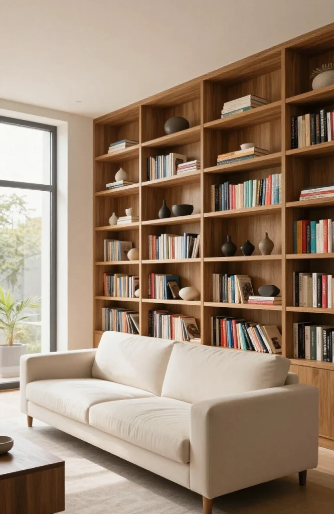
Floor-to-ceiling bookshelves along one wall of the living zone create a strong visual backdrop for the seating. They function as both storage and decor and give the living area a sense of enclosure without walls. Style the shelves with books and objects in the room’s palette. Avoid filling every shelf to capacity since a mix of books, objects, and intentional empty space reads as designed rather than just stored, which matters in an open-plan space where the shelves are visible from across the room.
43. Add a Bar or Drinks Station to Define the Entertaining Zone
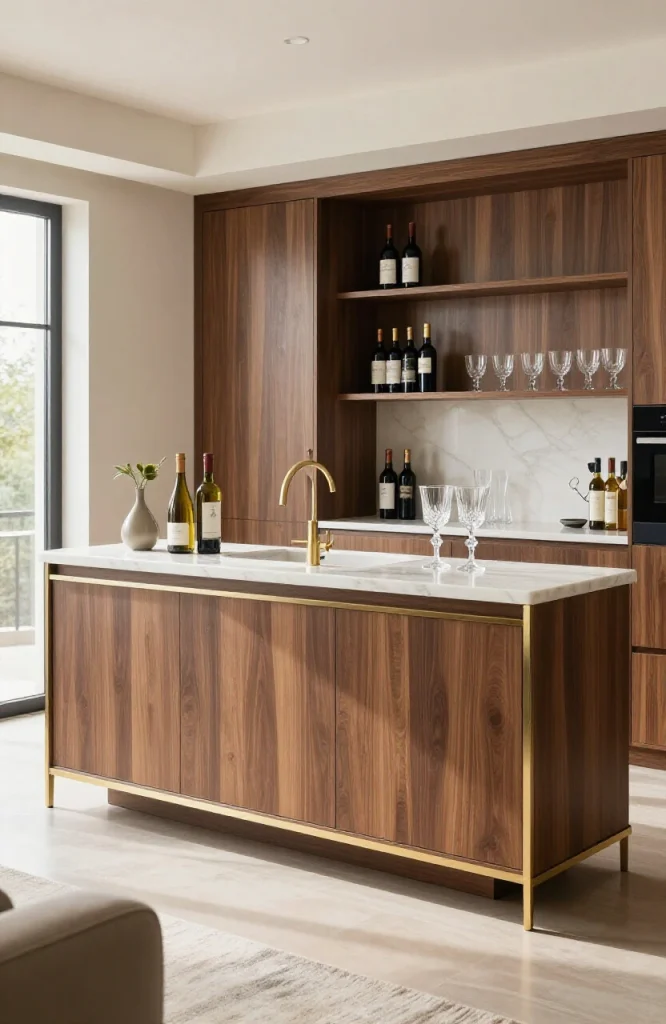
A dedicated bar station, set up as a sideboard with wine storage, organized glassware, and a drinks display, marks an entertaining zone within the open plan. It gives guests a place to gather that isn’t in the kitchen and creates a clear function for one section of the room. Position it along a wall between the kitchen and living zones so it acts as a natural gathering point during parties without blocking movement between areas.
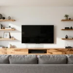
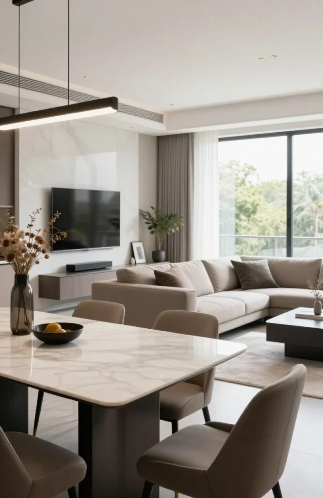
44. Use a Long, Low Media Console in the Living Zone
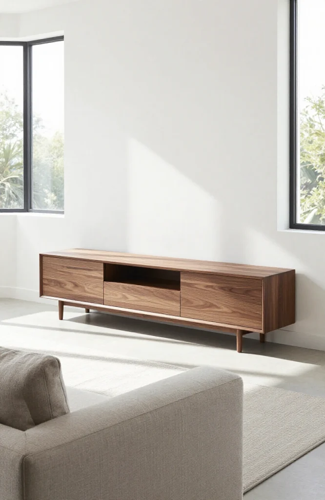
A long, low TV console or media unit anchors the living zone on the wall opposite the sofa. It creates a visual balance between the seating and the focal wall and keeps electronics contained in one area. A console that runs most of the wall length makes the zone feel intentional and not makeshift. When the console stretches close to the full width of the wall, the furniture and the wall read as one unified composition, which anchors the living zone more effectively than a smaller console centered in the middle.
45. Incorporate a Statement Light Fixture Over the Island
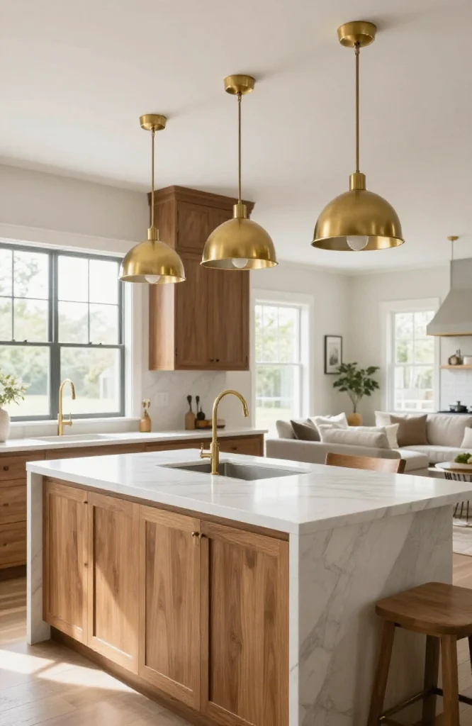
An island pendant light or a row of three pendants over the kitchen island marks the transition point between cooking and living zones. The fixtures should relate to the lighting in the living area, matching metal finish or similar style, so they connect the two zones rather than splitting them. For pendant spacing over an island, allow roughly 24 to 30 inches between each fixture center to distribute light evenly without overcrowding. A fixture that is too small in diameter relative to the island width will look undersized from across the room, so err toward a slightly larger scale than feels obvious up close.
46. Use Built-In Storage to Keep the Space Clutter-Free
In an open-plan home, clutter is visible from everywhere. Built-in storage options like window seats with drawers, ottomans with lids, and kitchen pantry cabinets with doors keep items out of sight. Clutter-free zones are easier to read as distinct areas and feel more intentional. Designing each storage piece to match the surrounding surfaces, rather than standing out as furniture additions, makes the storage feel like part of the architecture rather than a workaround.
47. Add a Breakfast Bar for Informal Dining
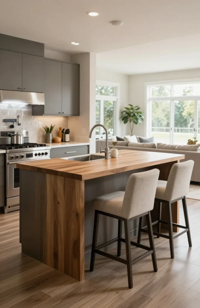
A raised counter on the kitchen island, with bar stools on the living-room side, creates an informal eating zone between the kitchen and the living area. This is different from the main dining zone: it handles quick meals and casual seating, and it marks the kitchen perimeter clearly. Standard bar height is 42 inches, which pairs with stools at 28 to 30 inches. Counter height at 36 inches works with stools at 24 to 26 inches and feels slightly less formal, which suits open-plan kitchens meant to feel approachable rather than separated from the rest of the home.
48. Use Upholstered Dining Chairs for Visual Softness
Hard dining chairs in an open-plan space can read as stark, especially when the living zone has soft upholstered seating. Adding upholstered dining chairs, even partially upholstered ones with cushioned seats, brings softness to the dining zone and reduces the visual contrast between kitchen and living areas. Choosing an upholstery fabric that repeats a color from the living zone sofa or throw pillows strengthens the connection between the two areas without requiring any additional decor changes. For more ideas on creating a luxurious bedroom aesthetic with soft furnishings, the same principles of texture layering apply.
49. Incorporate Natural Materials to Warm a Large Open Space
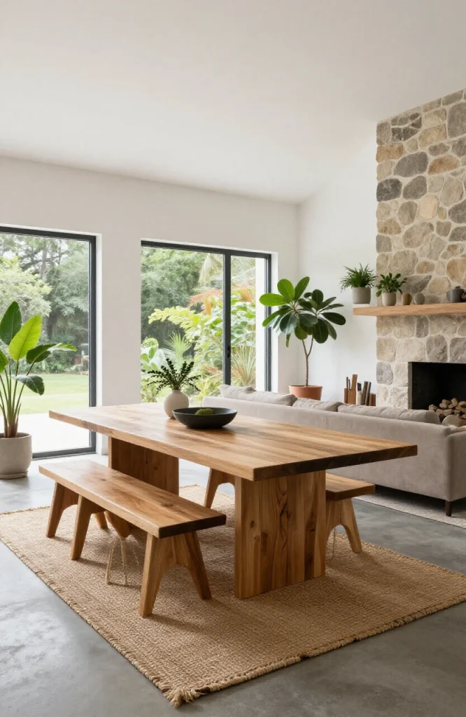
Large open-plan spaces can feel cold, especially in homes with concrete floors, white walls, and minimal furniture. Adding natural materials adds warmth and reduces the institutional feel of a large undivided space. A jute rug, a reclaimed wood dining table, linen curtains, and a rattan pendant light are all practical starting points. Natural materials also introduce tonal variation, which creates depth in a neutral palette that might otherwise feel flat. Mixing at least three different natural material categories, such as wood, fiber, and stone or clay, gives the space enough organic texture to feel lived-in without looking rustic.
50. Design Each Zone With Its Own Focal Point
Every zone in an open-plan space should have one clear focal point: a fireplace in the living area, a statement pendant above the dining table, a range hood in the kitchen. When every zone has a focal point, the eye moves naturally from one to the next rather than drifting aimlessly across the room. This single principle governs almost every other decoration decision in an open-concept home. Without it, even the most carefully chosen palette and the best furniture placement will feel directionless because there is nothing for the eye to anchor to in each area.
Bringing It All Together: Open Floor Plan Decoration That Works
Decorating an open floor plan well is fundamentally about solving one problem: how do you give a space clear structure when there are no walls to do it for you? The 50 open floor plan decoration ideas in this guide approach that problem from every angle, because no single fix works in isolation. Rugs define zones on the floor. Lighting claims them from above. Furniture placement creates edges. Materials and color tie everything together.
The ideas that do the most work with the least effort are the ones that operate at multiple levels at once. A well-placed large sectional defines the living zone, creates a natural walkway boundary, and signals the seating area from the moment someone walks through the door. A row of island pendants in the right metal finish both lights the kitchen and visually connects it to the living area two zones away. A consistent window treatment pulls the entire perimeter of the space together without touching a single piece of furniture. These layered decisions are what separate open-plan spaces that feel designed from those that just feel big.
When prioritizing where to start, work from the floor up. Get the rug placement and flooring transitions right first, because every furniture and lighting decision builds on top of that foundation. From there, address furniture scale and placement, then overhead lighting, and finally accent layers like art, hardware, and textiles. When the base layer decisions are right, the finishing details fall into place without as much trial and error.
Not every idea in this guide will apply to your specific space or budget. The most useful approach is to identify the two or three problems causing the most friction in your current layout, find the ideas that directly address those problems, and apply them before adding anything else. Open-plan decorating is iterative. Small, targeted changes to zoning and lighting often shift how the entire space reads, and starting there gives you the clearest picture of what still needs work.